Oversupplied Growth Corridors: Not Too Hot, Not Too Bad
A closer look at where new housing supply is concentrated and what that can mean for market interpretation.
Explore price growth, rental yields, development hotspots, market trends and demographics across Australia using real property data.
Live rankings from the same database that power the app. Top overall, growth and oversupply locations, with detailed statistics for each ranking.
Editorial analysis built from the same data behind the maps: growth, yield, supply, cleaning challenges and suburb-level signals.

A closer look at where new housing supply is concentrated and what that can mean for market interpretation.
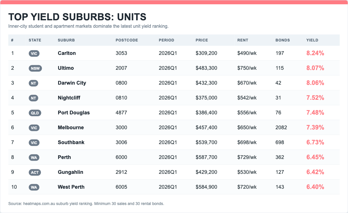
Mining towns, student towers and real cash flow in the latest yield rankings.
Why some top-growth rankings need a second look before they become an investment thesis.
Compare house and unit prices, growth, rents, yields, sales, new supply and community indicators. Each profile brings the available evidence together and offers a protected Excel data download.
Explore Suburb ProfilesStart with a state or jump into the app for suburb, postcode and map-layer analysis.
Heatmaps combines price, rent, yield, supply, demographics and location context into one property research interface.
The new homepage gives readers and search visitors context. The app remains one click away for returning users and deeper research.