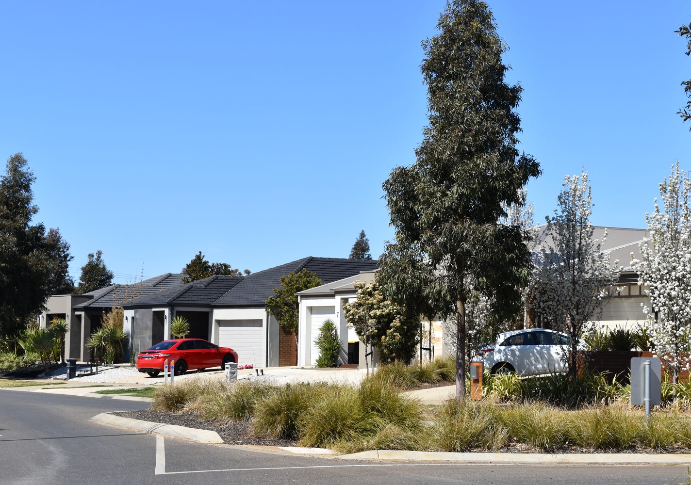
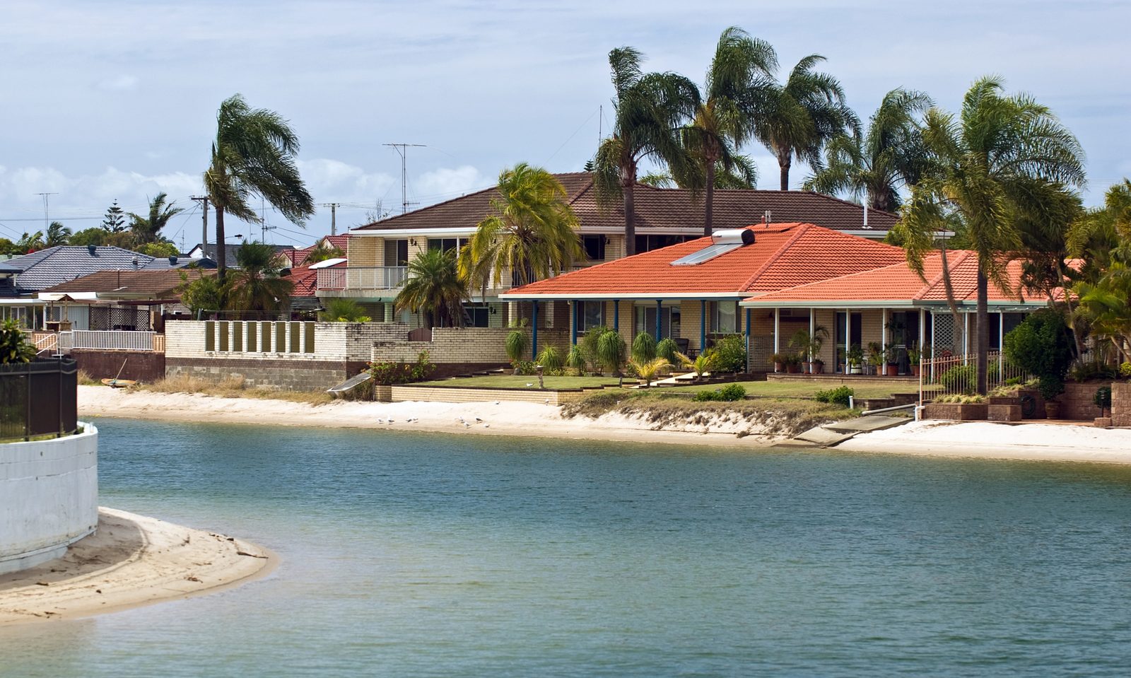
Growth corridors have a branding problem. They are where new homes are actually being built, which means buyers often worry about oversupply, identical house-and-land packages, thin resale demand, and long selling times.
That concern is reasonable. But the data is more balanced than the stereotype. When we looked at the biggest oversupplied house-building regions in Australia, most did not behave like disaster zones. Many simply moved with the wider state market. A few lagged. A few strongly outperformed.
How We Tested It
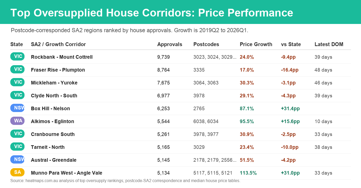
The oversupply ranking is built at SA2 level, using residential building approval counts. Price data on the map is postcode-based, so the analysis below uses the same practical bridge the site uses: each SA2 is matched to its most relevant postcodes, then the postcode house-price timeline is compared with the state-wide house-price line.
This is not a perfect SA2 median. It is a correspondence view. But it is useful because it answers the investor question: when the map takes me from an oversupplied SA2 into its matched postcode market, do the local prices look broken, ordinary, or surprisingly strong?
THE BORING MIDDLE Outer Melbourne Mostly Tracks, But Often Lags
Melbourne's outer west and north dominate the oversupply list: Rockbank - Mount Cottrell, Fraser Rise - Plumpton, Mickleham - Yuroke, Tarneit - North, Wollert, Werribee - West and related corridors. These are the places people often mean when they say "growth corridor".
The result is not dramatic. Rockbank - Mount Cottrell rose about 24.0% from 2019Q2 to 2026Q1, compared with roughly 33.4% for the Victorian house line. Fraser Rise - Plumpton was weaker at 17.0%. Tarneit - North was about 23.4%. In simple terms, buyers were not wiped out, but many of these markets did not beat the state.
That is the neutral lesson. High supply can cap the upside because a buyer has alternatives: a new estate down the road, another stage released by a developer, another very similar four-bedroom house. But demand still exists. Families still need somewhere to live, and affordability still matters.
OUTPERFORMERS NSW, SA, WA and Parts of QLD Were Stronger Than Expected
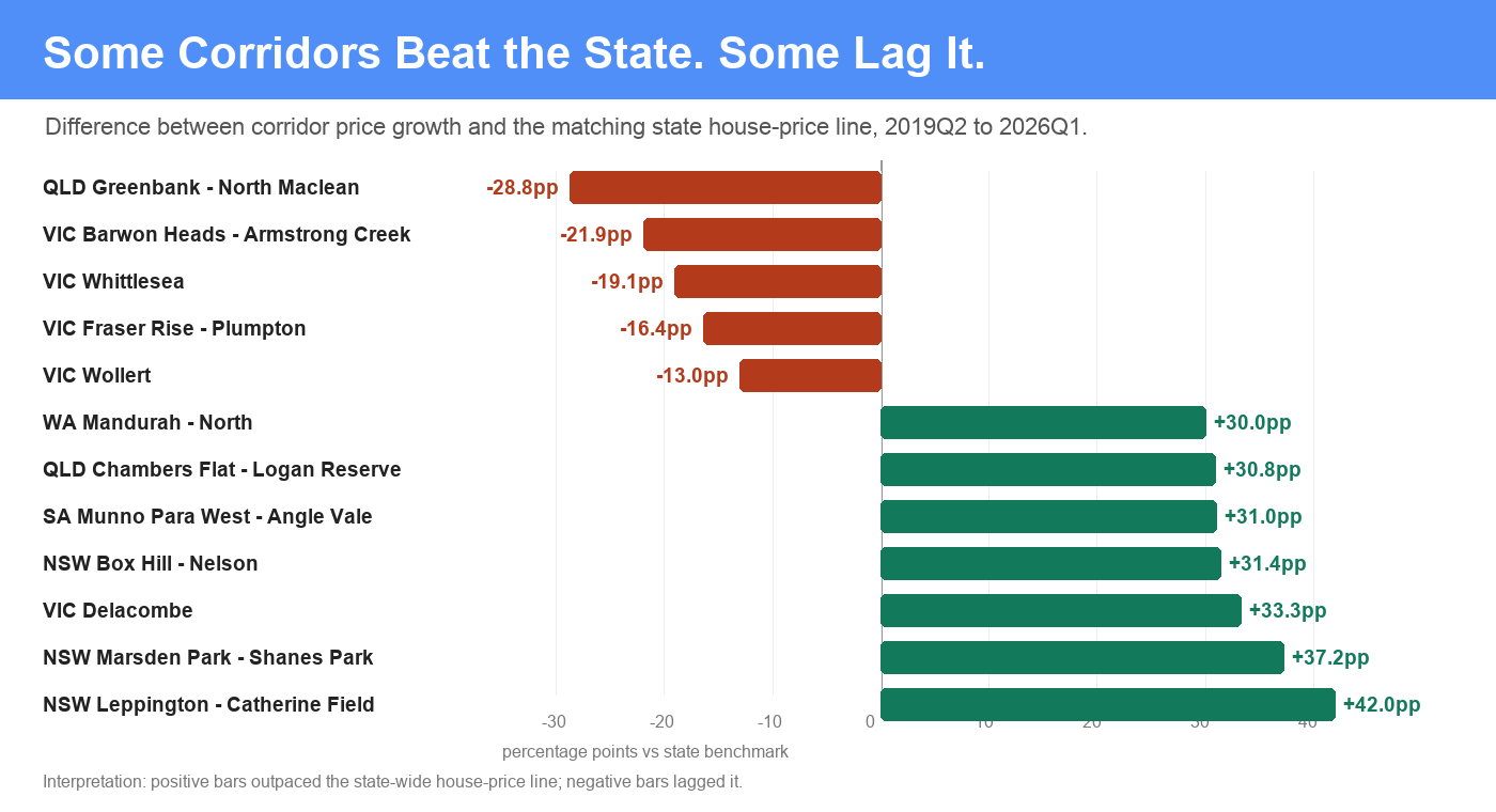
The surprise is that some of the most oversupplied corridors did very well. Box Hill - Nelson in Sydney's north-west rose about 87.1%, well ahead of the NSW state house line. Marsden Park - Shanes Park and Leppington - Catherine Field also outperformed strongly.
Outer Perth was also impressive. Alkimos - Eglinton rose about 95.5% versus an already strong WA state line near 80.0%. Brabham - Henley Brook and Mandurah - North were also ahead of the state benchmark. In South Australia, Munno Para West - Angle Vale more than doubled in the period, beating the state line by about 31 percentage points.
WATCH THE STOCK MIX The Numbers Are Real, But Not Always Clean
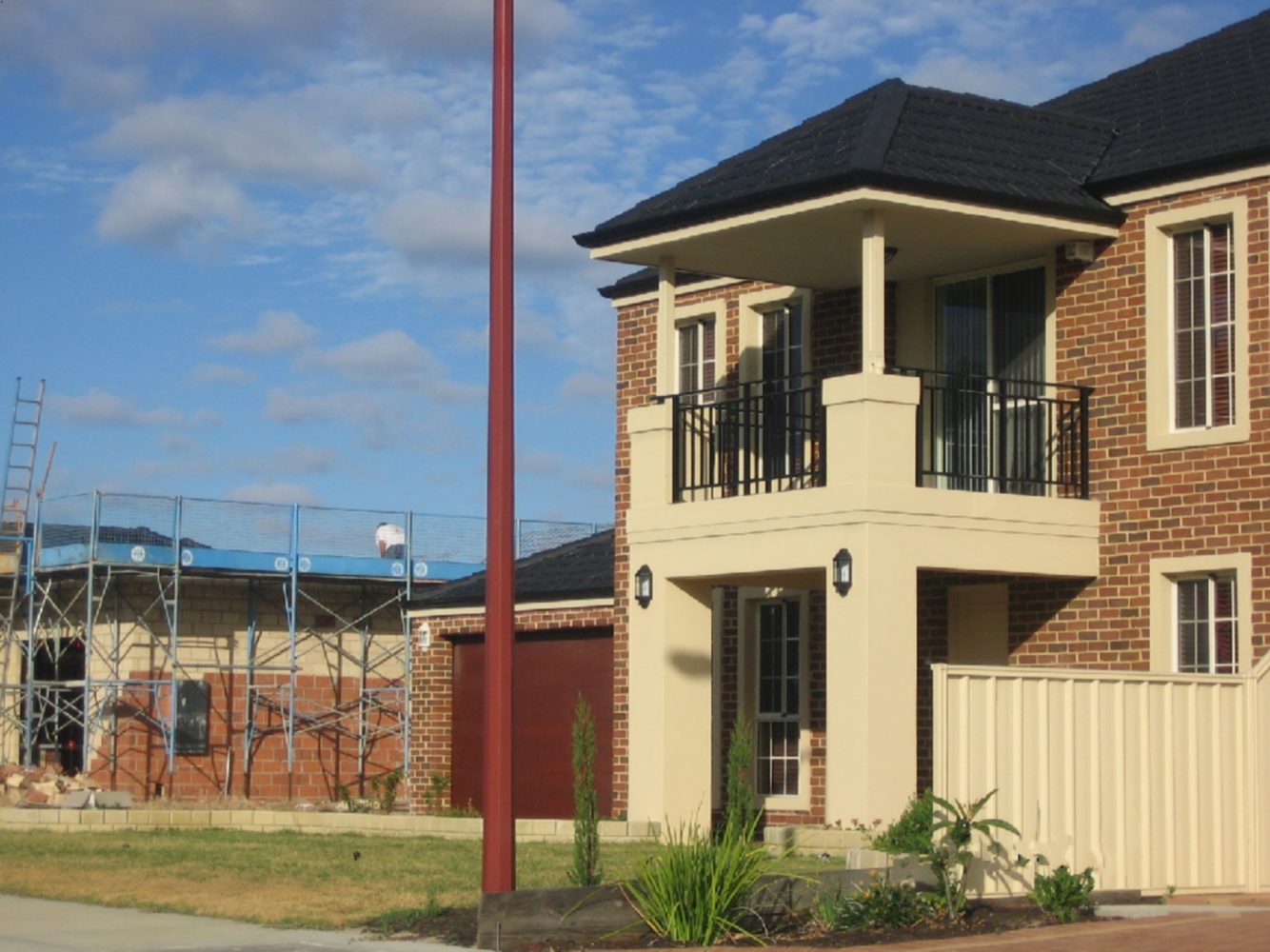
There are two reasons to stay careful. First, the SA2-to-postcode bridge can mix several suburbs and price points. Second, growth corridors have changing stock. A suburb can move from vacant land and first stages into larger homes, finished infrastructure and more established streets. The median price can rise because the product being sold has changed, not only because every house became more valuable.
That does not make the signal useless. It just means the chart should start the research, not finish it. If an area looks strong, click through to the postcode or suburb, inspect the sales table, and check whether the recent sales are comparable with what you would actually buy.
What About Days on Market?
I expected the most oversupplied corridors to show slow selling conditions. The data does not fully support that. Some of the latest days-on-market readings are fairly normal or even tight: Alkimos - Eglinton is around 10 days, Brabham - Henley Brook around 13, Chambers Flat - Logan Reserve around 21, Rockbank - Mount Cottrell around 39, and Fraser Rise - Plumpton around 48.
There are caveats. Days-on-market data may be thinner in new estates, and developer sales do not always behave like normal resale campaigns. If a large share of stock is sold off-the-plan or through builders, the public resale signal can understate the true time it takes to clear supply.
The Practical Investor Takeaway
Oversupplied growth corridors are not automatically bad investments. They are usually efficient, affordable, family-oriented markets where new detached housing is being delivered in volume. That volume can limit scarcity, but it also creates the suburbs, roads, schools, shops and population base that make a market real.
The risk is not that every growth corridor is doomed. The risk is overpaying for a generic product in a place where buyers have too many near-identical alternatives. The safer version is to look for improving infrastructure, deep owner-occupier demand, strong absorption, reasonable days on market, and a price line that is at least keeping pace with the state.