Every quarter, property investors scan "top growth" suburb lists like it's a treasure map. The allure is obvious: there's money in momentum. But here's what we found when we tested this quarter's top 10 growth suburbs against reality: some of the eye-popping numbers are statistical illusions. And the most interesting market isn't at #1 with 103.8% growth—it's at #10 with 42.2%, validated by cotton prices, 30-day sale times, and a regional council confirming housing shortage through fee waivers.
We dug into all 10 suburbs from the heatmaps ranking engine. Here's what the data tells us, and what local knowledge had to add.
The Top 10: What the Rankings Show
The heatmaps ranking filters for suburbs with at least 30 house sales in both 2024 and 2025, and a minimum median price of $200,000. It's a reasonable filter—designed to screen out thin trading volumes. But even reasonable filters can't separate genuine price appreciation from the "greenfield composition problem," where a new estate looks like it's appreciating wildly when really, the housing stock being sold is just changing.
Here are the 10 suburbs with the highest year-on-year growth percentage:
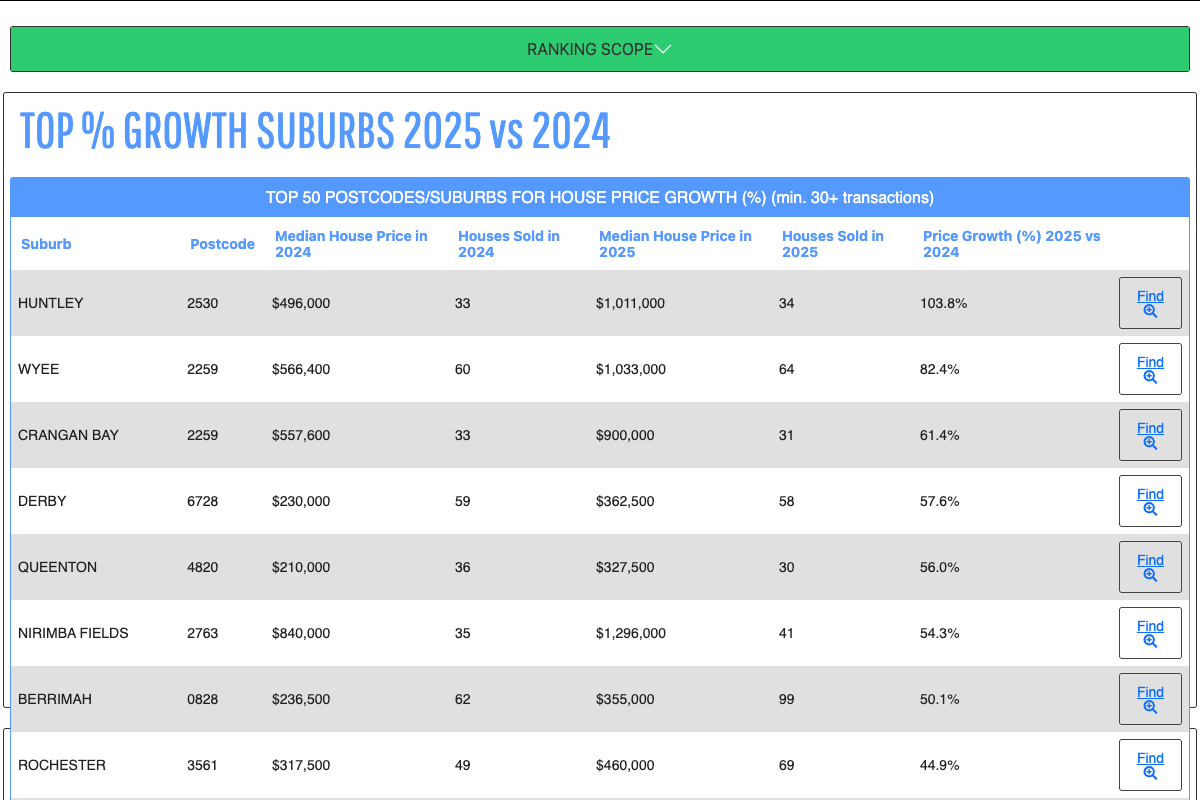
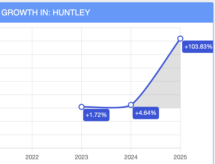
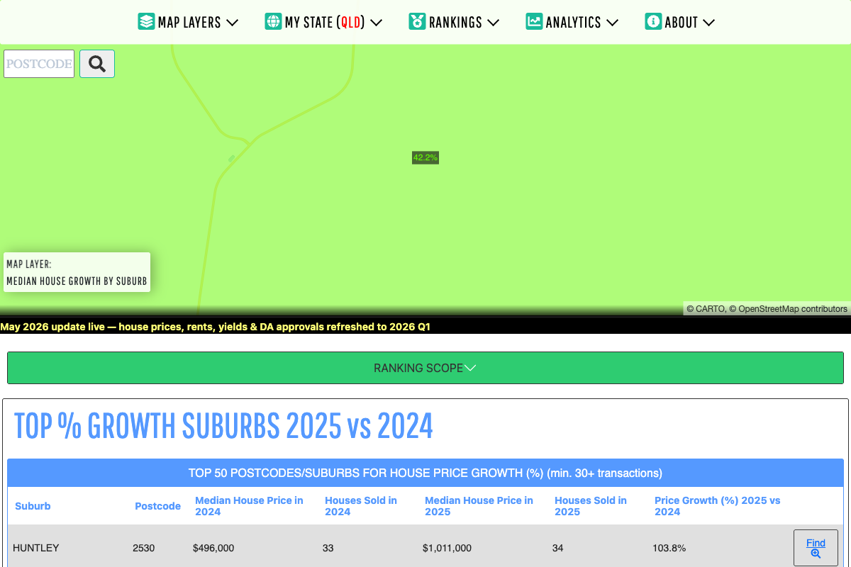
❌ DATA ARTIFACT Huntley NSW: A Suburb Being Built From Scratch
Huntley is a real place near Wollongong with a 2021 Census population of 66 people. It sits inside the West Dapto Urban Release Area—one of NSW's largest greenfield rezoning projects. The median house price jumped from $496,000 to $1,011,000 in a single year. That's a doubling. And it's almost certainly meaningless.
Here's why: with only 33–34 sales in a town of 66 people, you're essentially measuring the entire suburb turning over with newly-built houses on newly-released lots. In 2024, early-stage land packages and smaller homes on initial releases were settling. By 2025, later-stage subdivisions released larger, finished homes on premium positions. The "price growth" isn't an appreciation of like-for-like properties—it's a change in which properties are being sold. The colliery site (556 hectares, now slated for a Greg Norman golf resort and 530+ residential lots) is real. The rezoning is real. But the 103.8% figure is a statistical mirage.
❌ DATA ARTIFACT Crangan Bay & Nirimba Fields: The New Estate Problem
Crangan Bay is a 623-lot masterplanned estate by Scape Properties on Lake Macquarie's foreshore—a genuine location, but effectively a suburb that didn't exist in 2021. The population was zero. By 2024, early-stage subdivisions were settling. By 2025, premium lakefront stages (Stage 5) were releasing. A Lake Macquarie lakefront lot costs dramatically more than an inland lot in the same estate. The median jumped 61.4% between years—but different "product" was being measured.
Nirimba Fields, near Schofields in western Sydney, was gazetted as a suburb in 2020 on the former RAAF base. Developed by Defence Housing Australia, it's now in year four of construction. In a new estate, year-four sales are structurally different from year-three sales: larger, more complete, better-positioned homes. Add a genuine NW Sydney corridor growth (the Metro, new schools, infrastructure), and the underlying appreciation might be real at 15–25%. But the reported 54.3% is heavily inflated by compositional change.
⚠️ PARTIALLY GENUINE Wyee NSW: Real Drivers, Amplified Figure
Wyee is different. With a 2,909-person population (up 21% since 2016) and 60–64 house sales in the ranking period, this is an established, real suburb. Lake Macquarie Council rezoned multiple sites for housing in 2024, including land at Hue Hue Road for a 1.4-hectare supermarket and retail centre—a genuine amenity lift. NSW's Transport-Oriented Development policy opens up density within 400m of Wyee's existing train station. The affordability story is real too: Wyee was historically cheap, a working-class commuter suburb. As Sydney's north got expensive, Wyee was one of the last affordable pockets in the Lake Macquarie catchment.
But 82.4% in a single year on established stock? There's still amplification happening. New-build homes entering the sales mix at higher price points alongside older stock can distort medians. The genuine underlying story—rezoning, infrastructure, affordability catch-up—likely generates 20–35% real growth. The rest is measurement artifact.
✅ GENUINE GROWTH Derby WA: When a Mine Changes Everything
Derby is a remote town of ~3,700 people in Western Australia's Kimberley region. The heatmaps ranking shows 57.6% growth ($230k → $362k). And unlike the greenfield cases above, this one is defensible.
The Thunderbird Mineral Sands Project—one of the world's largest high-grade zircon deposits—went operational in January 2024. That's a hard date with a real causality chain: 401 direct jobs created, with 50% of workers residing in the Kimberley (most from Derby or nearby Broome). The rental market validates the story: median weekly rent is $470 with a gross rental yield of 10.47%—extraordinarily high and a clear signal of housing undersupply driven by demand from mining workers and their families.
The downside: regional commodity markets are cyclical, and mining-driven growth can reverse quickly if commodity prices fall. But for now, the 57.6% figure has real explanatory power. Multiple independent property data providers corroborate the growth rate, and the timing aligns perfectly with the mine opening.
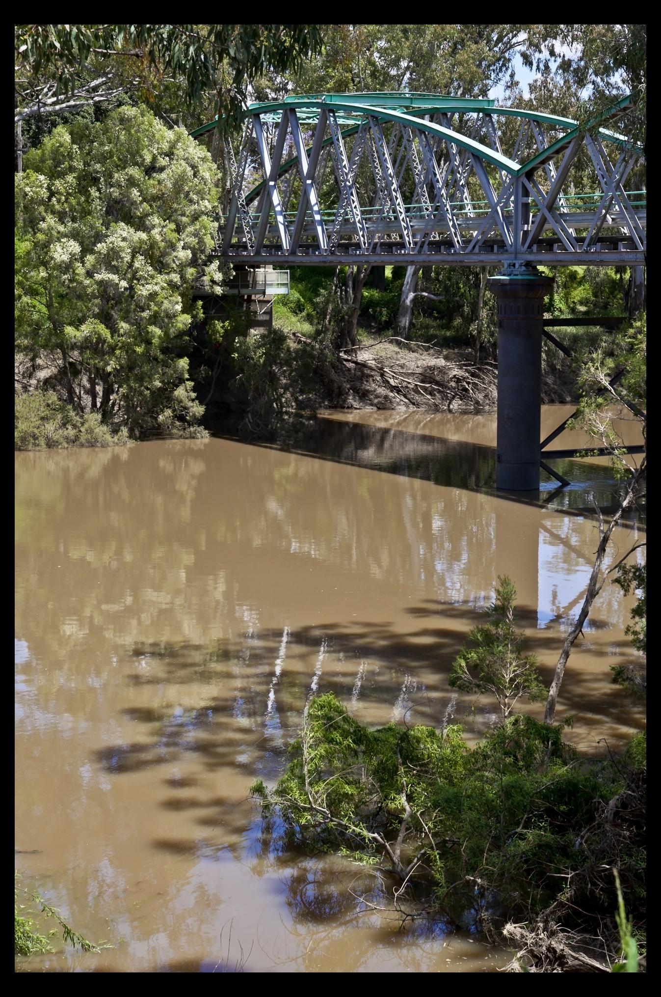
✅ GENUINE GROWTH Rochester VIC: The Flood Paradox
Rochester, a rural town in Victoria's Campaspe Shire, suffered a catastrophic 1-in-500-year flood in October 2022. Streets were inundated, homes destroyed, schools and hospitals damaged. You'd think property would crash. Instead, Rochester shows 44.9% growth ($317k → $460k) and a 40% jump in transaction volume (49 → 69 sales).
Here's the counterintuitive part: Victoria chose not to run a property buyback scheme (unlike NSW's Northern Rivers program post-2022). That meant the destroyed housing stock was removed from supply, and the town recovered into a scarcity environment. Properties that were flood-damaged and unsaleable in 2023 became saleable in 2024 as remediation works completed. Flood-safe, newly-raised, or substantially-retrofitted homes now command a premium. Reconstruction costs inflated replacement value. A council planning update was promised (the 2025 Flood Study refresh), creating speculative buying from those anticipating rezoning to lower-risk areas.
The growth is real, but the mechanism is complex. Average days on market sits at 134—much slower than Derby's likely pace—suggesting some price tension between buyers and sellers. The market is bifurcated: flood-safe homes appreciated strongly; flood-prone properties anchored by risk perception.
✅ GENUINE GROWTH Goondiwindi QLD: The "Boring" #10 is Actually the Most Trustworthy
Goondiwindi (QLD/NSW border, population ~6,300) shows 42.2% growth—the lowest headline figure on the list. But it's the strongest statistically supported result of all 10.
Sample size: 96–104 house sales. By far the largest trading volume in the rankings. Market speed: Average days on market = 30 days—extremely fast for a regional town, signalling genuine buyer competition and demand pressure. Economic drivers: Goondiwindi is at the heart of Australia's cotton belt. Cotton contributed $3.1 billion to agricultural GDP in 2024 and is forecast to exceed $3.6 billion in 2025. The Murray-Darling Basin (where Goondiwindi sits) accounts for 91% of Australian cotton farms. High cotton prices combined with a good growing season in 2023–24 meant farm incomes surged. Historically, that translates directly into rural property demand.
Add lifestyle migration—tree-change buyers from both QLD and NSW drawn to affordability, decent amenity (schools, hospital, retail), and border town arbitrage—and the picture is complete. Goondiwindi Regional Council has confirmed housing pressure through fee waivers on water connections, plumbing, drainage, and building applications, a signal that demand is real and supply is tight. Multiple independent data providers report the growth rate consistently.
The reported 42.2% will likely normalize over time as supply catches up. But unlike Huntley's 103.8%, this number represents something genuine.
Five Questions to Ask Before Acting on Any Growth Ranking
Not every suburb in a top-10 list deserves the same credibility. Before you make a decision based on a growth ranking, ask:
- Is the suburb established or greenfield? New estates will always show inflated growth due to composition change. An established suburb with stable housing stock is more trustworthy.
- How many sales are we measuring? Fewer than 50 sales is statistically fragile. 96+ sales (like Goondiwindi) is robust. Huntley's 33–34 sales across 66 residents is almost meaningless.
- What's the rental yield? If growth is real, rental yields should be consistent with the market. Derby's 10.47% yield validates mining-driven demand in a way that words cannot.
- Is there a once-off event? A mine opening (Derby), a disaster (Rochester), a major rezoning (Wyee)—these are explainable catalysts. Generic "growth" without a trigger is harder to rely on.
- How fast is it selling? Days on market tells a story. Goondiwindi's 30 days signals real buyer competition. Rochester's 134 days suggests price tension and a bifurcated market.
The Real Lesson
Data is the starting point, not the answer. The heatmaps ranking engine is doing exactly what it should—surfacing suburbs where median prices moved significantly. But a "significant move" can mean wildly different things: a new estate selling higher-priced later-stage homes (Huntley), a flood reducing supply (Rochester), or a mining project bringing 400 jobs to a small town (Derby).
The investors who succeed are the ones who see a high growth number and ask: "Why?" Then they research. Then they drive through. Then they talk to locals. That's where data and local knowledge collide—and where real opportunity lives.
Explore These Suburbs on the Map