Australian House Price Heatmap
Compare median house prices and price growth across Australian postcodes, suburbs and small statistical areas - then inspect the sales history behind each colour.
Price level and price movement are different questions.
A house price heatmap can show where homes are expensive today, or where prices have changed most quickly. Those signals are related, but they are not interchangeable.
Median house price
Use the median-price layers to compare the typical recorded house sale across nearby areas. This is useful for affordability screening and understanding the price structure within a city or region.
House price growth
Use growth layers to compare change over time. A lower-priced market may be growing quickly, while an expensive market may be moving slowly or declining.
Start with the map. Confirm with the underlying sales.
Colour is a fast comparison tool, not an investment conclusion. Select an area to inspect its median price, transaction count and price timeline. A strong result supported by many ordinary sales is more dependable than a dramatic result created by only a few unusual transactions.
- Check the period. Annual and quarterly views can tell different stories.
- Check the sample. Low sales volumes can make medians unstable.
- Check the stock. New estates, acreage and premium homes can change the mix.
- Check nearby areas. Isolated movement deserves additional local research.
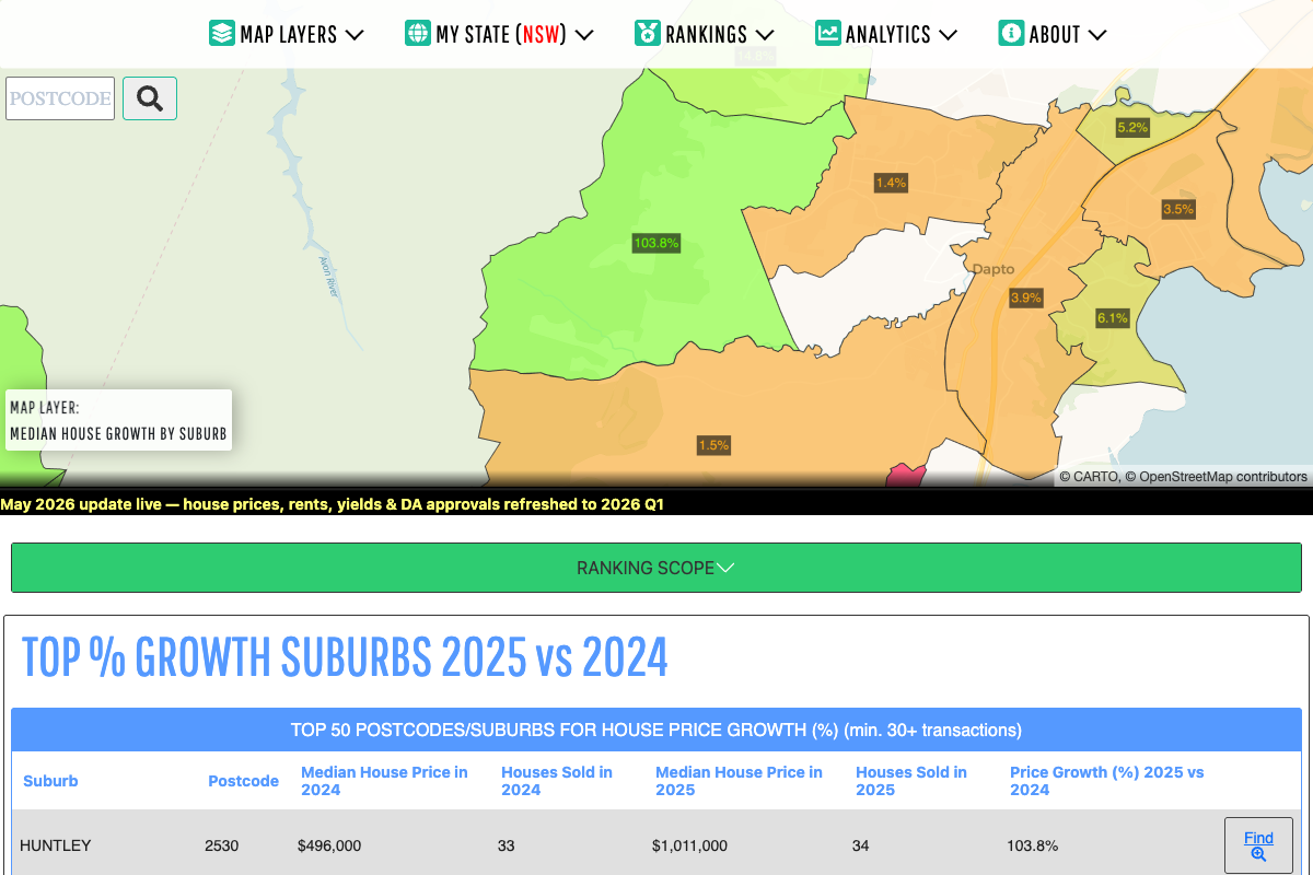
Broad comparison or local detail?
Fast regional comparison
Useful for scanning a city or regional market. A postcode can contain several neighbourhoods and different housing types, so it is best treated as a first filter.
Recognisable local markets
Useful when comparing named suburbs that buyers and agents commonly discuss. Boundaries still do not guarantee identical housing stock.
Fine-grained context
Small statistical areas can reveal differences hidden inside a postcode, but smaller samples demand more caution and supporting local evidence.
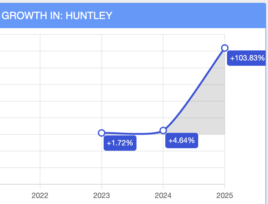
A precise calculation can still need a local explanation.
Median prices are calculated from recorded transactions. When a new estate begins settling, when larger blocks sell, or when only a handful of properties change hands, the typical sale can shift sharply without every established home rising by the same amount.
Heatmaps helps identify the movement and inspect the timeline. Local development knowledge, comparable sales and the character of the housing stock are still needed before treating the result as an investable signal.
Read the data-versus-reality investigationOpen the house price map in your market.
The app opens with the annual median house price by postcode layer. Change geography or switch to growth after establishing the local price range.
What this heatmap should not be used for.
Area medians do not estimate the value of a particular property.
Historical growth does not guarantee future price movement.
Release timing, geographic coverage and classification can differ between jurisdictions.
Planning, supply, condition, finance and local comparable sales still matter.
See the source notes, processing approach and known limitations in Data & Methodology.
House price heatmap FAQ
What does a house price heatmap show?
It assigns colours to geographic areas according to a property metric, such as median house price or percentage price growth. The colour helps compare nearby markets quickly.
Should I compare house prices by suburb or postcode?
Postcodes are useful for broad screening. Suburbs generally provide a more recognisable local comparison, while smaller statistical areas can expose variation within both. The best choice depends on sales volume and the question being investigated.
Why can median prices jump when the broader market feels unchanged?
The mix of properties sold may have changed. A small number of premium homes, new-estate settlements or low transaction volumes can move the median significantly.
Does the map include units?
Yes. Heatmaps provides separate house and unit price layers where the source data supports them, because combining those property types can conceal important differences.
Compare Australian house prices on the map.
Start with median price, choose a location, then inspect growth and transaction history before drawing a conclusion.